A Better Temperature Bar Chart
The Oregonian weather page shows a graphic by AccuWeather. Across the top, a bar chart that shows temperature for 24 hours. The chart always in blue. It makes me think it is showing how much RAIN WATER is expected. Instead, the being all blue, the bars could be coded with the same color as in the temperature Key at the bottom of the chart. Here is the chart. (Two colored Arrows added by JM.)
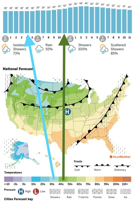
Here's the way the chart is is shown...
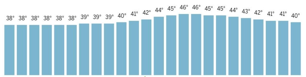
Here's the way March 14 could have been shown...

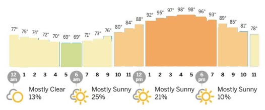
A typical summer chart should have several colors in the day-hour-temp bar chart, instead, it's all blue..
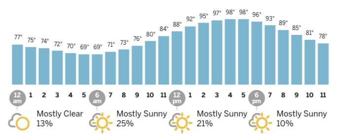
Here is that same summer day with color-coded temps, using the same temp-color key as the map:
Sorry for the graphic size mismatches! I need to do them over. Any volunteers? LoL
I wrote to the Weather chart people on March 21, 2025 asking them to consider making this change. I think the resulting graphic would be more interesting, and convey more information.
Their immediate canned response was: Your suggestions are extremely valuable to us and we will share your suggestion with our team. These insights give us an idea of the features you love and where we can improve. So please continue to provide any feedback that may help us to improve your experience.
Now we will wait to see if they ever do anything. LoL. They'd have to figure out a way to automate the process of applying a color. Maybe the challenge will stimulate action. I looked at USA today weather charts - Boring! Surprisingly colorless.